Amazon Redesign✏️

Introduction
This project is my first ever UI UX design project and being self-taught, I’ve tried to bring the Amazon shopping app into the modern era through some really interesting and fun techniques.
Why redesign?
The Amazon shopping app has undergone multiple evolutions so far and this time I wanted to bring this app to the modern era.
Another reason why I chose amazon was just simply because of the cluttered UI (promotions, Product suggestions etc.)
Overall, the app was a little cramped and tough to navigate, with the UI elements being extremely close to each other and sharp edges on corners everywhere.
These days everyone prefers a “rounded” aesthetic compared to a “sharp” one.
Challenges
1. Cluttered UI :
Almost all the UI elements in the current version of the app are very close to each other, even the app banner and posters look a little cluttered and hard on the eyes.
2. Refining the experience:
The UI elements (banners and posters) have sharp corners, the contrast between some of the texts and backgrounds is not apparent, most of the elements are not sufficiently spaced out and the colour palette throughout the UI seems a little non-uniform.
Solutions
Introduction of Soft UI elements to improve aesthetics and to create a focussed User experience.
Rounded corners were also implemented into most of the interactive(touch) elements to make the UX cleaner and inviting.
Also implemented a soft and toned down colour scheme (drastically reducing popping and contrasting colours) to provide a more focused, clean and minimalist look to the user interface.
Soft UI Components

The Soft UI components used in this redesign are mainly of 2 components. I call them “raised” and “lowered”, these 2 components provide the aesthetic that they’re being “raised” or “lowered” from the screen respectively.
Homescreen Redefined
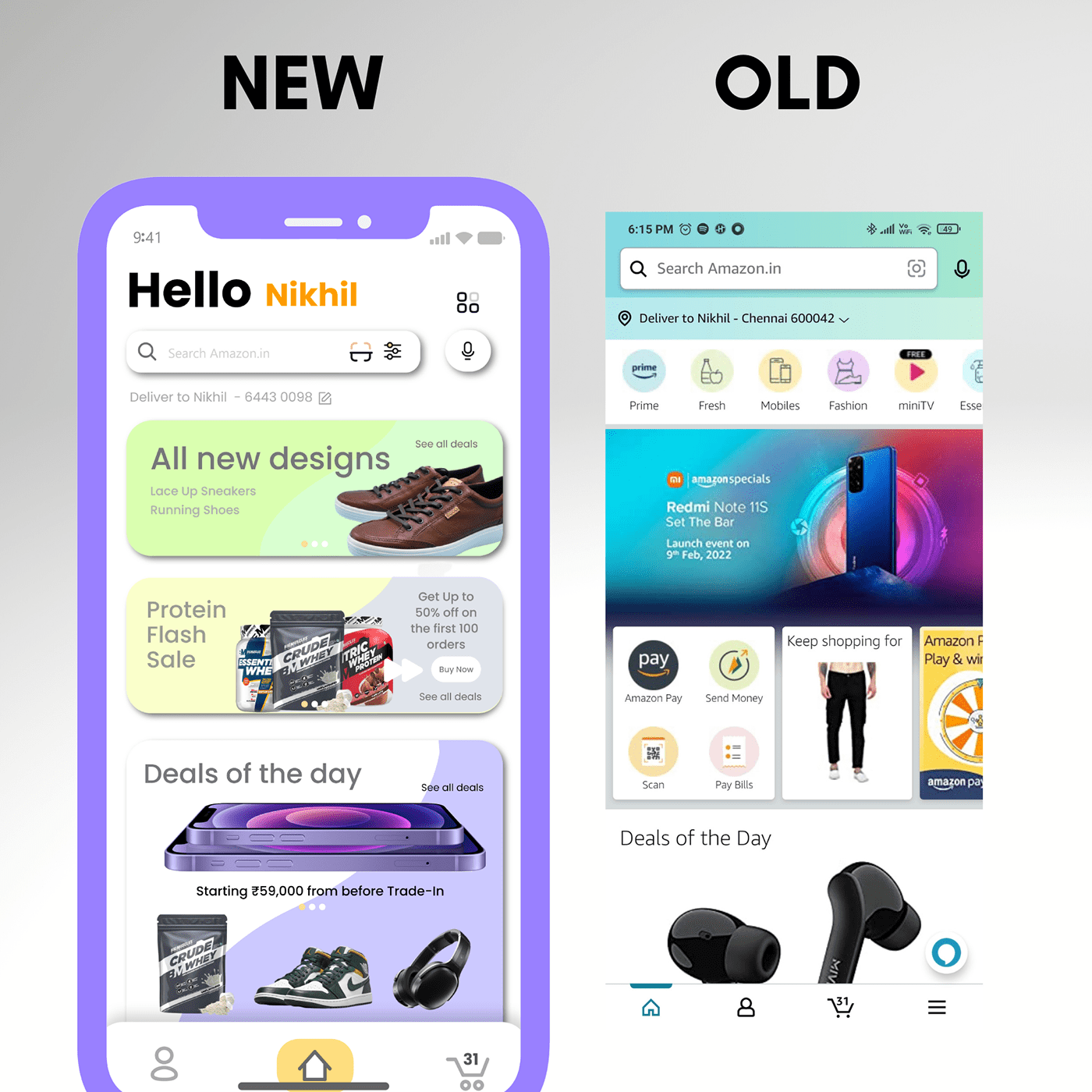
The Home Screen 🏠 according to me received the main overhaul in terms of look and feel. The Promo(banners)/carousel flaunt pastel-like colours, complementing the soft UI well.
. In the current version of the Amazon shopping app the Homescreen was being overly crowded with too many banners, and that is why I’ve assumed that amazon wants these promotions to catch the user’s eye and hence keeping this assumption in mind I’ve redesigned the home screen in a way that makes maximum use of the space while maintaining the minimalistic feel of the UI.
Rounded corners and soft UI make for a clean and focused homepage and it invites Users to explore each element/Promotional material on display.
The search bar was also redesigned keeping in mind the above parameters.
Cart and Search Results

🛒Both these pages have been heavily redesigned keeping in mind the “Soft UI” components.
The font “Poppins(Regular/Medium/Bold)” has been used to provide a more minimalist aesthetic.
Product Page Redesigned

For the product page🧩, I wanted to separate the product image from sections like product info/buy, add to cart/etc. And that’s why I ended up creating a separate “raised” soft UI element to house all these sections.
Typography

Throughout the UI the font used was “Poppins(Regular/Medium/Bold)” and it was used mainly as “Regular” and “Medium” to make the text more minimalistic.
The colour palette of the font also follows the same “toned down” trend as discussed earlier, mostly involving lighter tones of greys and deep Blacks.
Thank you for reading!😁
Disclaimer: These views and opinions are personal
Product images and logo credits:
Amazon,Nike,Bigmuscles


